Unit 5: Comparing Designs and Art
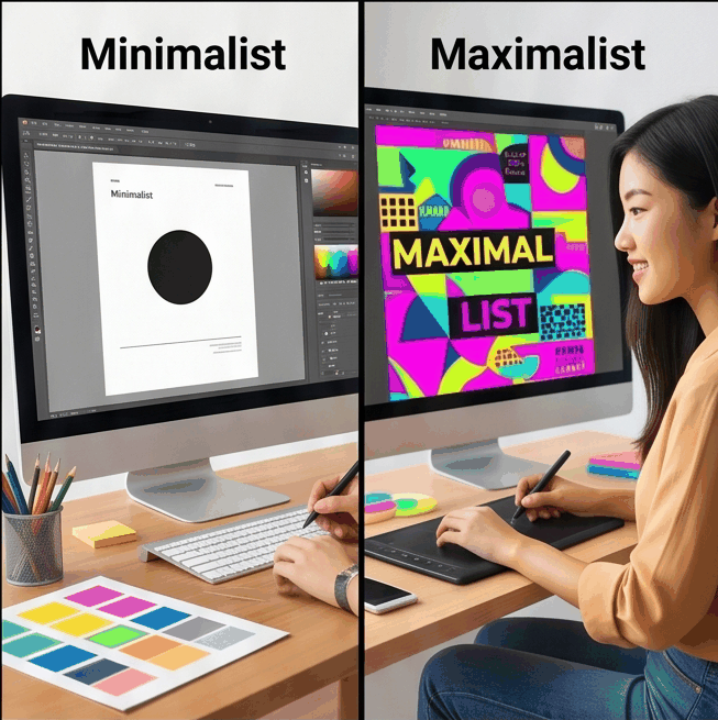
In this unit, you will learn simple words and structures to compare two different designs, layouts, or artworks. You will practice talking about what makes one design bigger, brighter, or better than another.
Trong bài học này, bạn sẽ học các từ vựng và cấu trúc đơn giản để so sánh hai thiết kế, bố cục hoặc tác phẩm nghệ thuật khác nhau. Bạn sẽ thực hành nói về việc tại sao một thiết kế lại lớn hơn, sáng hơn hoặc tốt hơn một thiết kế khác.
Vocabulary: Words to Compare Art and Designs
- bigger - larger in size
- smaller - less in size
- better - higher quality
- worse - lower quality
- more - a larger amount
- less - a smaller amount
- bright - with strong light or color
- dark - not bright; low light
- colour - the look of something (red, blue, etc.)
- line - a long thin mark in a drawing
- shape - the form of something
- style - a way of creating art or design
- picture - an image or artwork
- design - a plan or drawing for something
- creative - showing new ideas
Grammar: Comparisons
1. Comparatives: bigger, smaller, better, worse
Use comparatives to compare two things:
- This design is bigger than that one.
- The picture is better than the old one.
- The colour in this drawing is darker than the other.
2. More / Less
Use more or less to compare quantity or quality:
- This picture has more colour than the first one.
- There is less line in the second design.
3. There is / There are for comparison
Use these phrases to describe what exists in a design or artwork:
- There is more light in this painting.
- There are more shapes in the first picture.
Example: Comparing Two Designs
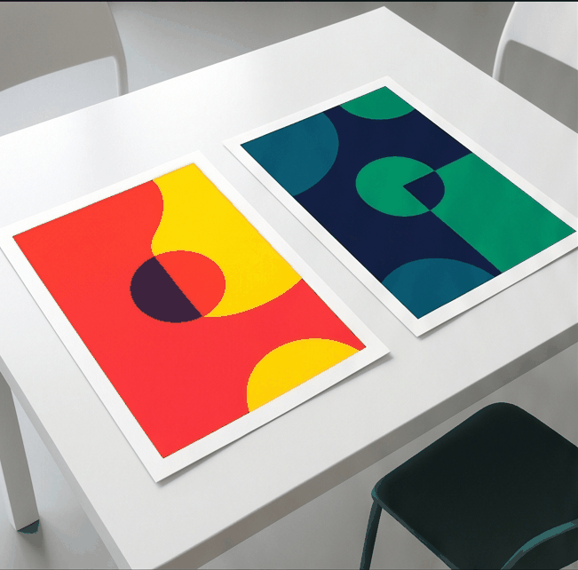
Example 1: The first design is bigger than the second design.
Example 2: The second design is darker and has less colour than the first one.
Example 3: There are more lines in the first design.
🔑 Đáp án & Giải thích
Ví dụ 1: "bigger" dùng để so sánh kích thước giữa hai thiết kế.
Ví dụ 2: "darker" và "less colour" mô tả màu sắc và mức độ sáng của thiết kế thứ hai.
Ví dụ 3: "more lines" dùng "there are" để chỉ số lượng đường nét trong thiết kế.